A design system that aligned design and development across an AI platform

Design System Architecture
Component Library Design
Governance & Documentation
A design system that aligned design and development
across an AI platform. Built over about six months
and maintained as an ongoing project, for an AI driven
mis/disinformation platform.
I was lead designer on a core
team of five. 100+ components adopted across multiple
product teams, still in use when I left the business. A
previous attempt had failed before I joined, so the job was
as much getting it adopted as getting it built. Towards the
end we started using AI to audit the codebase against the
system, catching drift between design and code.
Case Study
A design system had been attempted previously which failed before I joined Logically. The teams were smaller and didn't have capacity to take on another project, and the attempt tried to deliver a whole system before anyone used it, which meant no early wins and nothing to build momentum on.
On top of an already complex platform, two different systems between design and development meant concepts were tricky to explain and deliver, and by the time a feature was built there'd be no time left to tackle UI inconsistencies. Technical debt was building and developers were finding it easier to build their own versions of components in silos.
Stakeholders and decision makers were understandably sceptical about dedicating a team to the project. As a design team, we kept surfacing it in demos and wider product check-ins, so by the time we presented the solution to leadership, they were aware that it was a growing problem.
We got the go ahead. The team was two designers, two developers and a product owner. My role was lead designer, the main decision maker on the design side, supported by a junior designer.
Before building anything we needed a structure to work to. I'd used the atomic design structure before, as had one of the developers, so we proposed it as the model. Everything is built from the stage before it, you can't build complex components without simple ones, and you can't build simple ones without tokens. That gives you early wins at the bottom and a system that scales at the top.

The design team's system wasn't built on tokens and designers had gone straight into components, with variants that weren't named or were difficult to understand.
The front-end audit surfaced multiple versions of components, including 60 buttons all largely doing the same job and hundreds of static values used across the product. We were also running multiple component libraries with Bootstrap handling most of the product.
We each presented potential systems to build from, ranging from Tailwind to MUI. We landed on building our own in both Figma and code. Rebuilding on the atomic structure was quicker than retrofitting what the design team had, and injecting a large scale system was risky if the project was liable to fail.


With tokens in place we had the base for everything else. Over the following six months we worked up through the atomic structure, atoms, molecules, organisms. In practice that meant a button, then an input form, then a filter set. Starting with the simplest elements meant something was in use within weeks rather than months.
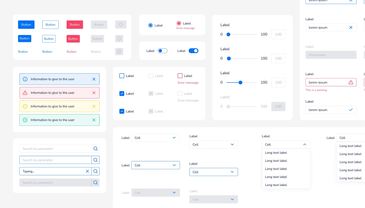
What became a component came down to repetition. Anything appearing more than a few times was worth building, and variants were named by function rather than appearance. Buttons, for example, ended up as 15 variants across two sets, three sizes and five types, regular, secondary, loading, disabled and error. That replaced the 60 plus button variations the audit had surfaced.
Keeping ourselves motivated was down to us. The quick wins carried us at the start, but the later components were more complex, and we sometimes spent more time getting back up to speed than actually building.


We kept governance deliberately light. Design drove most new components, documented with usage guidance and criteria for when a new one was justified, so developers rarely needed to build their own. When they did, they built it and we brought it into the system afterwards rather than putting an approval process in front of them. Some slipped the net and we'd go back to understand what they'd built and why.
We took the same approach with the graph kits we'd inherited, integrating and restyling them rather than rebuilding. Most decisions went this way, least friction, because the project had already failed once by asking for too much up front.
Pairing sessions kept the two systems in sync, and I went in to make naming consistent down to the word. Storybook gave both teams somewhere to see what existed. Later we started using AI to audit the codebase against the system.

A system that was widely adopted and still in use right up until I left the business.
UI inconsistencies dropped off. We fixed most of them, so we stopped having to fight for time to tackle them alongside feature work. On the design side, designs were almost entirely assembled from existing components unless something genuinely new was needed, which was the clearest signal it was working.
Conversations between design and development got easier. Not perfect, but a lot less frustrating, and far less of the back and forth that used to come from working off two different sources of truth.
There were costs. We maintained the system alongside our normal work, and setting up a new component could be a chore when you just want to share a quick idea. The time was better spent than before.

I made assumptions about how willing developers would be to take on tokens, since it's a fairly basic concept. I'd work with the wider development team before that stage to address concerns first, rather than assuming even tokens would be willingly adopted.
I'd have gone back for more time once we had something to show. We'd proven it worked with tokens and the dark mode demo, which was the moment we had the most leverage, and using it to get dedicated time would have carried us through the slower stretch better than willpower did.
I'd also commit to a decision faster. We went back and forth on whether to build our own icon set before settling on a library, and the same thing happened with the graph kits. Both cost us momentum.